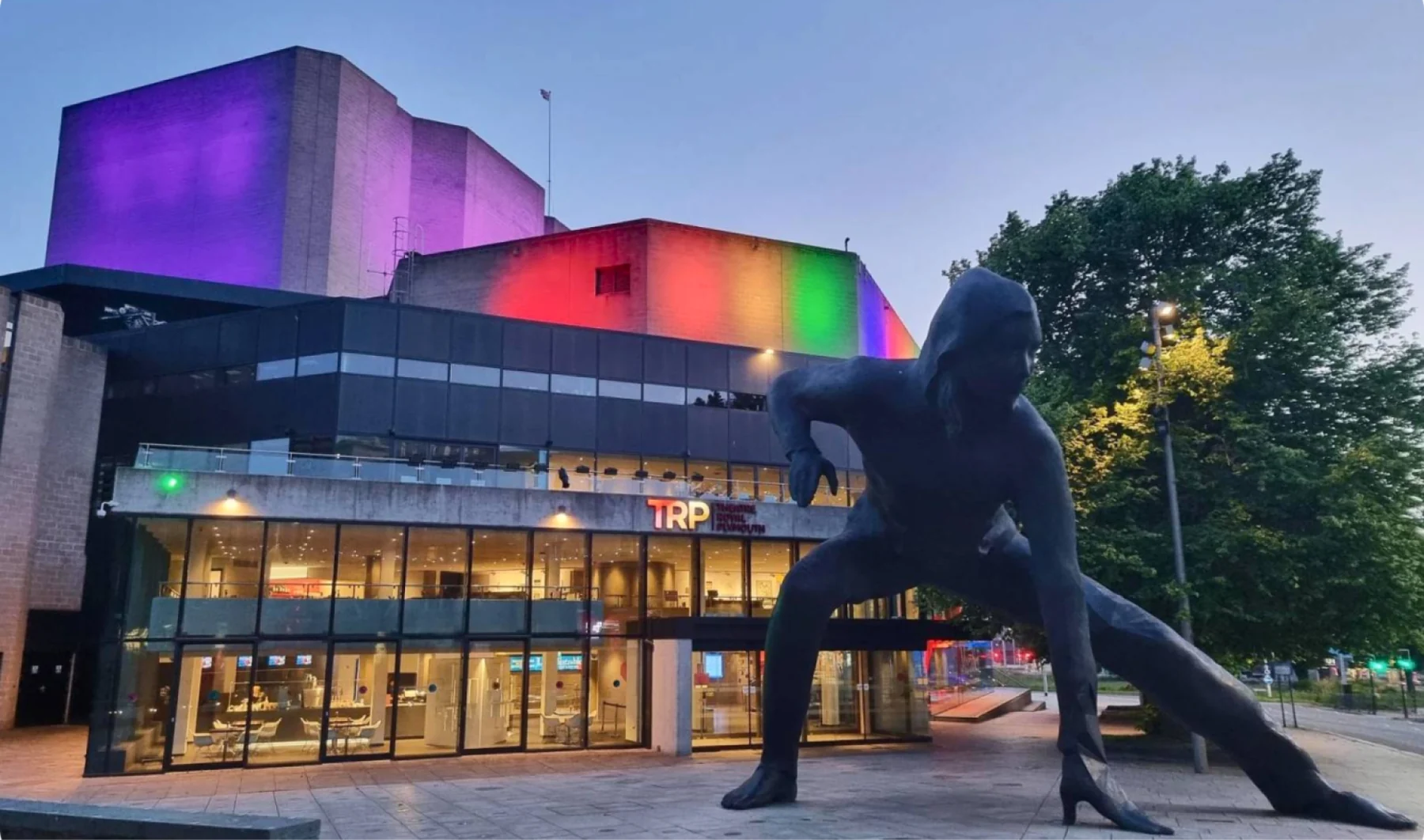
the brief
a refresh, not a rebrand
theatre royal plymouth is the region’s premier theatre, with over 300,000 visitors a year. as its first in-house graphic designer, the design function was built from scratch while the company changed management and wanted to polish its brand.
patrons were attached to the existing brand, so we stayed close to its style and used the elements already in place to unify a fragmented identity into one system across print, digital and front of house.
the system
one gradient, four pillars
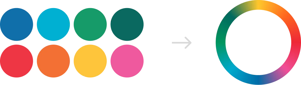
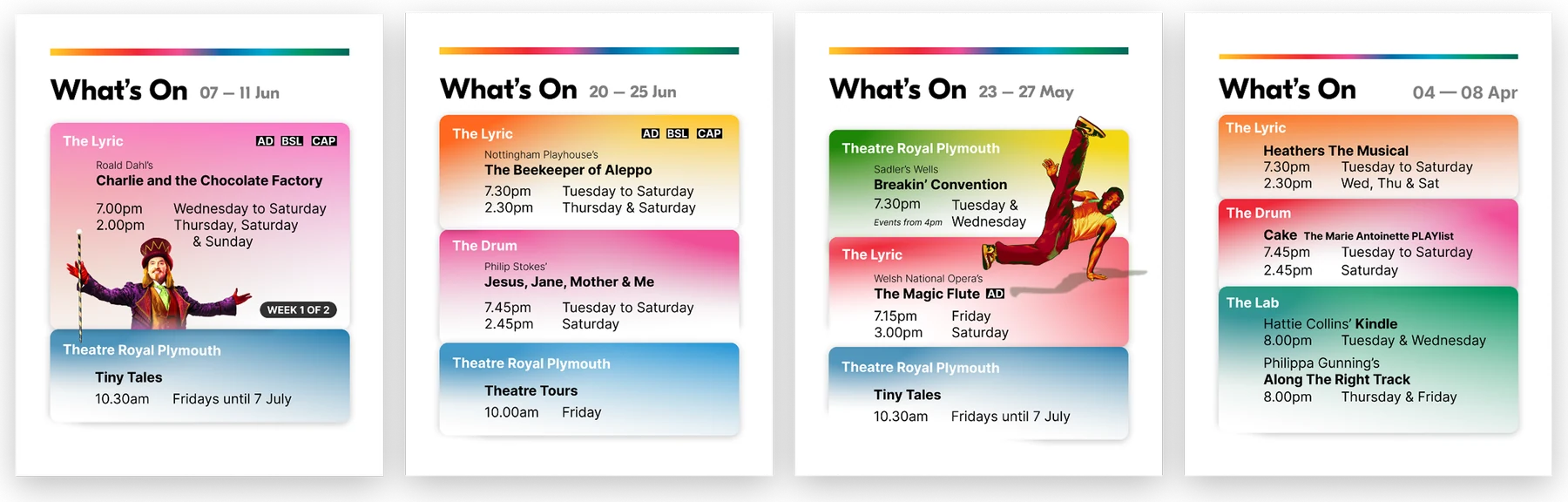
the key decision was merging the separate brand colours into a single gradient, a sign of renewed cohesion in the company.
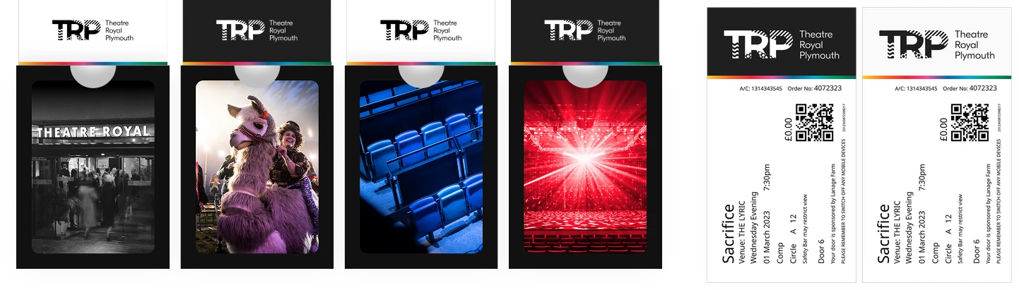
tickets were updated, and four new wallets were made, one for each pillar: honouring legacy, building community, nurturing local and showcasing global talent.
key art
artwork for shows of every size
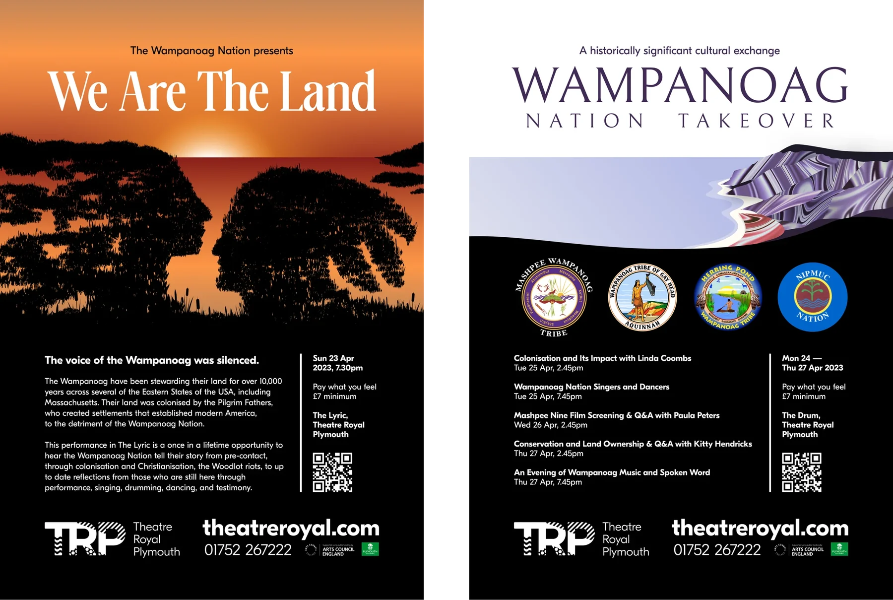
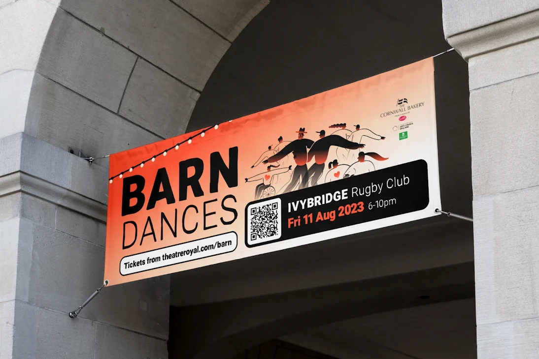
the theatre needed key art for everything from small local shows to large scale events, created once and exported to every platform.
we are the land tells the story of the wampanoag people through song, dance and spoken word. its design reflects the interplay of religion, colonialism and the disease that erased much of their heritage, and it was projected onto the building itself.
print that still earns its place
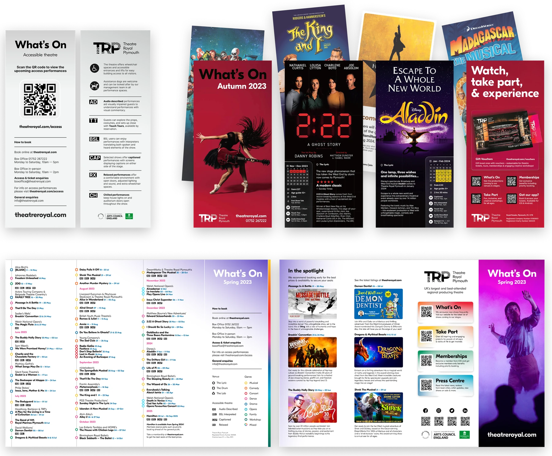
the venue has an older audience that relies on physical brochures, so we made fresh versions while aiming to cut paper use and cost.
a timeline style leaflet, an A4 folded in four, lays out the season in order across more than 100 shows a year. templates cover leaflets, direct mail and a new full season brochure, and a bookmark leaflet carries details of access performances.
digital and web
every screen, one look
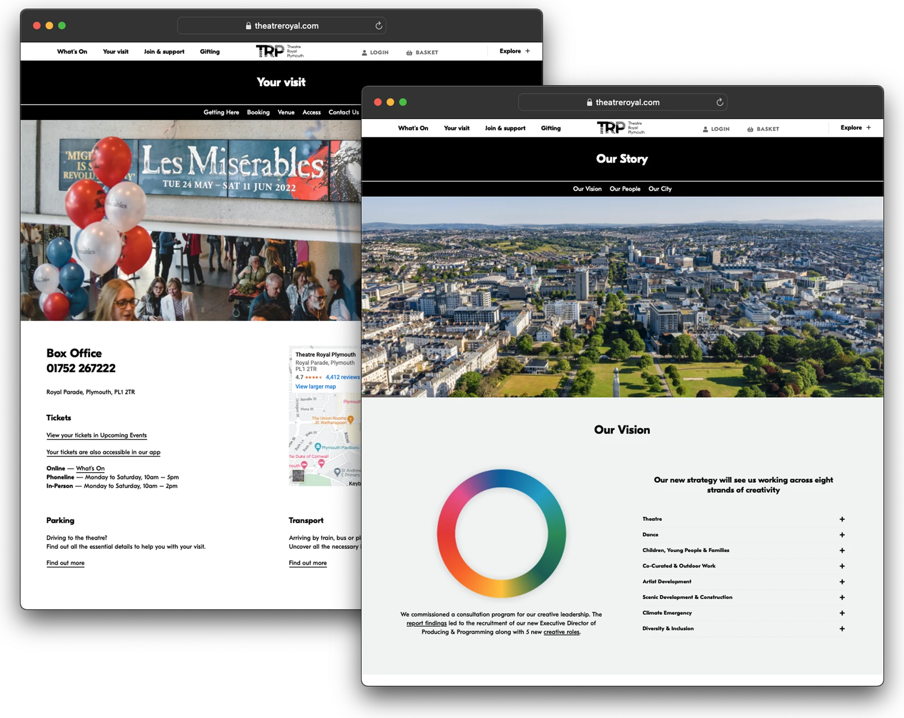
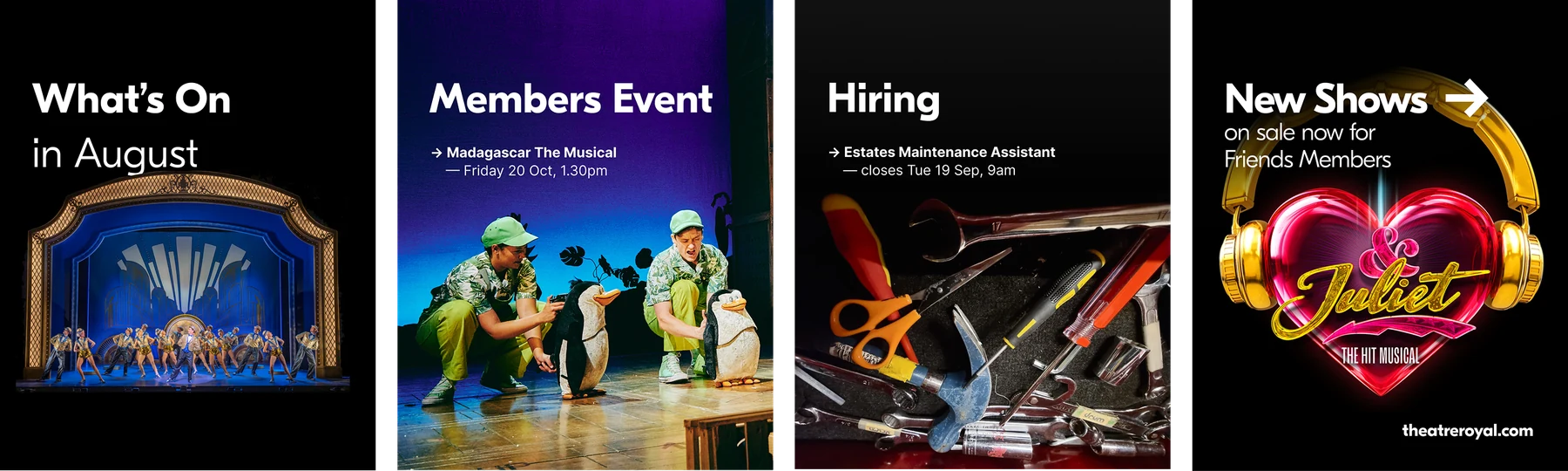
we refreshed the look across email templates, front of house screens in the auditoriums and digital ads in every format. on the website we tidied pages, added a new ‘our story’ area and improved the journey for ticket buyers.
with over 300 staff across three venues, we also wrote a style guide for the organisation’s social media, so every post reads as one theatre.
the result
one theatre, one look
one brand system across print, digital and front of house for a theatre staging over 100 shows a year, built to last.